
Bay Area Color Palettes: Designing with California's Natural Landscape
- Oct 1, 2025
- 8 min read
The San Francisco Bay Area offers one of the world's most diverse and inspiring natural color palettes, where rolling golden hills meet ocean fog, ancient oak groves create serene landscapes, and coastal waters provide endless inspiration. These distinctive landscapes don't just provide breathtaking views; they serve as the foundation for interior design that captures the essence of California living. Understanding how landscape influences interior design choices allows homeowners to create spaces that feel authentically connected to their surroundings, whether nestled in Peninsula hills or perched above San Francisco's fog line.
Creating harmony between indoor spaces and California's year-round beauty requires more than simply choosing paint colors that match the view. It's about understanding how light changes throughout the day, how different microclimates affect color perception, and how to translate the outdoors' organic palette into living spaces that feel both sophisticated and welcoming. The best Bay Area interiors don't compete with nature; they celebrate it.
Signature Bay Area Color Palettes
Ocean & Fog Palette: Coastal Paint Colors That Capture Seaside Serenity
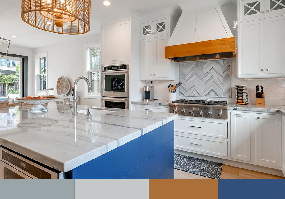
The Bay Area's maritime influence creates a distinctive color story of soft grays, weathered whites, seafoam greens, and muted blues that shift like morning fog. These coastal paint colors work beautifully in spaces where light plays across walls throughout the day, creating subtle variations in tone that mirror the ocean's ever-changing surface. When implementing these ideas in your home, consider how to mix lighter and darker elements for visual depth.
Our California Modern Coastal Home in Capitola perfectly exemplifies this palette approach. The design team selected gorgeous deep blue tones paired with airy neutrals to create a space with a relaxed, down-to-earth, and California cool vibe. The deep blues anchor the space while lighter neutral tones allow rooms to breathe, creating a seaside escape that feels both sophisticated and approachable. This color scheme maximizes the home's coastal location while providing a timeless backdrop for modern furniture and art. The strategic mix of dark and light paint creates dynamic visual interest throughout the space.
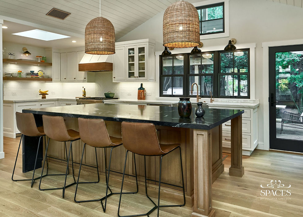
South Bay Palette: Sophisticated Neutrals with Statement Materials

Drawing inspiration from the Peninsula's upscale hillside communities, this palette emphasizes refined sophistication through warm natural woods, crisp whites, and dramatic statement materials. The approach balances organic warmth with striking contrasts, creating spaces that feel both welcoming and luxurious. These sophisticated color approaches work particularly well in areas like Saratoga and Los Gatos where the goal is timeless elegance with contemporary edge.
Our Transitional Saratoga Remodel showcases this South Bay approach through a carefully curated palette of warm light oak, crisp white surfaces, dramatic black marble, and gold accent details. The warm oak elements provide organic richness throughout the space, from custom cabinetry to ceiling details, while the striking black marble fireplace and range hood create bold focal points. Gold hardware and lighting fixtures add warmth and luxury, elevating the neutral foundation into something truly spectacular. This refined color scheme works beautifully in open-concept living areas where materials can flow seamlessly from room to room, creating cohesive sophistication throughout the home.
California Oak Palette: Natural Sophistication with Muted Tones

Inspired by the native oak groves that dot the Bay Area's hillsides, this palette embraces sophisticated muted tones that create serene, calming environments. The color story features earthy tones like soft gray-greens reminiscent of oak leaves, warm natural wood tones, and crisp whites that allow architectural details to shine. This approach works particularly well in areas like Los Gatos where natural beauty and refined living intersect.
Our Transitional Remodel in Los Gatos demonstrates this California oak approach through a thoughtful combination of cool gray-green cabinetry, light oak flooring, and clean white walls. The sophisticated gray-green millwork creates a sense of calm sophistication while the warm oak floors ground the space in natural beauty. Black hardware and fixtures provide crisp definition, while the overall palette creates a refined backdrop that feels both contemporary and timeless. This color scheme works beautifully in both formal and casual spaces, offering versatility that adapts to different lighting conditions throughout the day.
Seasonal Color Considerations and Natural Light

Bay Area microclimates present unique challenges for color selection. What looks perfect in sunny Peninsula light might appear completely different under San Francisco's marine layer. The key is choosing paint colors that adapt gracefully to changing light conditions throughout the day and across seasons.
Colors that work effectively in both bright, direct sunlight and filtered fog light tend to have warm undertones that prevent them from appearing cold or stark. Light beige and sandy neutrals, for example, maintain their welcoming appearance whether bathed in California sunshine or softened by coastal mist. These versatile hues provide the flexibility needed to create spaces that feel consistent regardless of outdoor conditions.
Geographic Color Variations Across the Bay Area
San Francisco: Urban Sophistication with Fog-Inspired Neutrals

San Francisco's unique urban environment, combined with its famous fog, calls for color schemes that embrace both sophistication and softness. Muted hues and neutral colors work beautifully here, creating spaces that feel refined without being cold. The city's Victorian architecture provides a perfect backdrop for monochromatic schemes that add personality through texture and contrast rather than bold color statements.
Peninsula: Hillside-Inspired Earth Tones and Natural Materials

Peninsula homes, particularly those featured in our Peninsula Estate Design: Creating Timeless Luxury in Atherton, Los Altos Hills, and Woodside article, benefit from palettes that reflect their hillside settings. Warm earth tones, combined with reclaimed wood elements and natural stone accents, create interiors that feel organically connected to their landscape. These colors work particularly well in open floor plans where interior and exterior spaces flow seamlessly together.
South Bay: Tech-Forward Palettes with Organic Warmth

The South Bay's technology-driven culture calls for color palettes that balance modern sophistication with organic warmth. Clean lines and fresh, bright hues work well in these spaces, often incorporating single color statements that add personality without overwhelming the overall design. The Bright & Inviting Silicon Valley Remodel exemplifies this approach, using a crisp white palette as a luminous canvas while allowing architectural elements and art to provide interest.
Color Psychology for California Living

Understanding color psychology becomes particularly important in Bay Area design, where many residents work in high-stress technology environments. Colors that enhance indoor-outdoor flow help create the sense of retreat that busy professionals need. As explored in our Home as a Retreat: Creating Spaces That Counter Silicon Valley's Fast Pace article, the right color palette can significantly impact mood and well-being.
Promoting wellness through nature-inspired palettes involves more than aesthetics. Green hues, whether sage or deeper forest tones, have been shown to reduce stress and promote calm. Warm colors like terracotta and golden yellow can energize spaces while maintaining a cozy, welcoming atmosphere. The key is finding the right balance for each room's specific function and the family's lifestyle needs.
Color Trends and Popular Paint Colors for Bay Area Homes

Current Bay Area color trends favor sophisticated neutrals with personality: colors that work beautifully with both modern furniture and traditional architectural elements. Popular paint colors include warm whites with subtle undertones, soft grays that change throughout the day, and carefully selected accent walls in deeper, more dramatic shades. These paint ideas often incorporate beige shades that provide warmth without overwhelming smaller spaces.
The trend toward biophilic design has influenced color choices significantly, with homeowners seeking colors that reflect their connection to nature. This might mean incorporating the warm browns of redwood bark, the soft greens of eucalyptus leaves, or the varied grays of coastal stones. When exploring these ideas, consider how to mix natural tones with more dramatic dark accents for sophisticated contrast. These choices create timeless interiors that won't feel dated as trends shift.
Expert Advice: Implementing Bay Area Color Schemes
When selecting a color scheme for Bay Area homes, consider the space's orientation, existing architectural elements, and the family's personal style. North-facing rooms in San Francisco might benefit from warmer undertones to compensate for cooler natural light, while south-facing Peninsula spaces can handle cooler colors without appearing stark.
The relationship between walls, trim, and ceiling colors requires careful consideration. Using the same color in different sheens can create subtle variation without disruption, while contrasting trim colors can highlight architectural details and add visual structure to a room. The key is maintaining harmony while creating enough contrast to define different elements within the space.
Integrating Natural Materials and Textures

Color palettes work most effectively when supported by appropriate materials and textures. Reclaimed wood adds warmth and authenticity to any palette, while natural stone provides grounding and sophistication. The interplay between color and texture creates depth and interest that single-color approaches cannot achieve alone.
In the Breathtaking Transformation in Almaden Valley, warm neutrals flow throughout the space, creating a sophisticated backdrop that allows organic textures and forms to take center stage. This biophilic approach demonstrates how color and material choices can work together to create environments that feel both grounded and fresh.
Frequently Asked Questions
What Are the Most Popular Paint Colors for Bay Area Homes?
The most popular paint colors for Bay Area homes include warm whites, soft grays, and sophisticated beiges that work well with natural light conditions. Benjamin Moore colors like Swiss Coffee and Hale Navy are frequently chosen for their versatility and timeless appeal. Swiss Coffee provides a perfect warm white backdrop that works beautifully in both sunny Peninsula locations and foggy San Francisco settings, while Hale Navy creates stunning accent walls that capture the depth of Bay Area coastal waters. These carefully selected Benjamin Moore hues provide excellent backdrops for both traditional and modern furniture while complementing California's indoor-outdoor lifestyle.
How Do I Choose Colors That Work with Bay Area's Changing Light?
Selecting colors for Bay Area's varied light conditions requires testing paint colors at different times of day and in various weather conditions. Colors with warm undertones typically perform better in both bright sunshine and foggy conditions. Consider how light enters each room and choose hues that enhance rather than fight against these conditions. Sandy neutrals and muted hues often provide the most consistent appearance across different lighting scenarios.
What Color Palette Works Best for Small Bay Area Living Spaces?
For smaller living spaces in the Bay Area, light and bright color palettes work most effectively to maximize the sense of space. Using variations of the same color on walls, trim, and ceilings can create continuity that makes rooms appear larger. Coastal paint colors, particularly soft whites and light grays, reflect available light while creating a fresh, airy atmosphere that doesn't overwhelm compact areas.
How Can I Incorporate Bay Area Color Trends Without Dating My Home?
The key to incorporating trends while maintaining timeless appeal is to use trendy hues as accents rather than dominant colors. Choose classic, neutral base colors for walls and major furniture pieces, then introduce current trends through accessories, art, and smaller decor elements. This approach allows you to refresh your space as trends evolve without major renovations.
What Colors Work Best for Enhancing Indoor-Outdoor Flow?
Colors that enhance indoor-outdoor flow typically mirror natural landscape elements visible from interior spaces. If your home overlooks golden hills, warm earth tones create seamless transitions. For coastal views, soft blues and grays work beautifully. The goal is to choose interior colors that complement rather than compete with outdoor views, creating a harmonious relationship between inside and outside spaces.
Creating Timeless Beauty Through Nature-Inspired Design
The most successful color palettes draw inspiration from a region's extraordinary natural beauty while reflecting the homeowner's personal style and lifestyle needs. Whether embracing the sophisticated neutrals of San Francisco fog, the warm earth tones of Peninsula hills, or the fresh, bright palette of coastal living, the key is creating spaces that feel authentically connected to their California setting.
Working with designers who understand Bay Area aesthetics ensures that color choices not only look beautiful but also function well within the region's unique environmental conditions. From maximizing natural light to creating seamless indoor-outdoor transitions, the right color palette becomes the foundation for spaces that truly capture the essence of California living.
Color palette selection forms the fundamental foundation of every successful interior design project, whether you're embarking on a comprehensive home remodel or building from the ground up. From selecting cohesive finishes for custom millwork to coordinating stone countertops with cabinetry and flooring, every design decision flows from your carefully chosen color story. Major renovations and new construction projects require this level of strategic color planning from the earliest stages to ensure seamless integration across all design elements.
At Spaces by Juliana Linssen, we specialize in large-scale interior design projects where color palette mastery makes the difference between a beautiful space and an extraordinary one. Whether you're renovating a Peninsula estate, designing a new South Bay home, or transforming a San Francisco property, our comprehensive approach ensures every finish, fixture, and furnishing works together harmoniously. From paint selection to material coordination, successful color palettes require strategic planning. Contact Spaces by Juliana Linssen to begin the process.


